Context
Olympe SA. is a software editor scale-up based in Lausanne, Switzerland. Its mission is to deliver a product that smartly interacts with people and existing systems to empower companies to instantly align IT capabilities with business decisions. Thanks to its unique 'code as data' technology, Olympe has been rewarded with various Swiss and European recognitions.
I joined the product team as an Front-end / Ux developer with the goal of helping implementing new features and improving its user experience.
The team has an external Ux designer with whom I worked closely through out this project. The company's focus is mainly pointed at improving the core code, leaving UX a smaller dedicated time.
At this point, the usability and the user research aspects were lacking. I took the opportunity to introduce them to the team.
Goals
I defined two main goals:
- Establish a heuristic evaluation of the current state of art.
- Start the process of User research within the time allowed.
Solutions
I. Heuristic evaluation
Overview
Target audience of the platform is composed of:
- Business people looking for a platform allowing them to create prototypes
- Developers looking to accelerate their developement
When I joined the company, the platform was only used by Olympe developers.
As no 'external' user test was done, the feature were often develop to suit the internal developers need and the user experience wasn't always intuitive.
Preparation
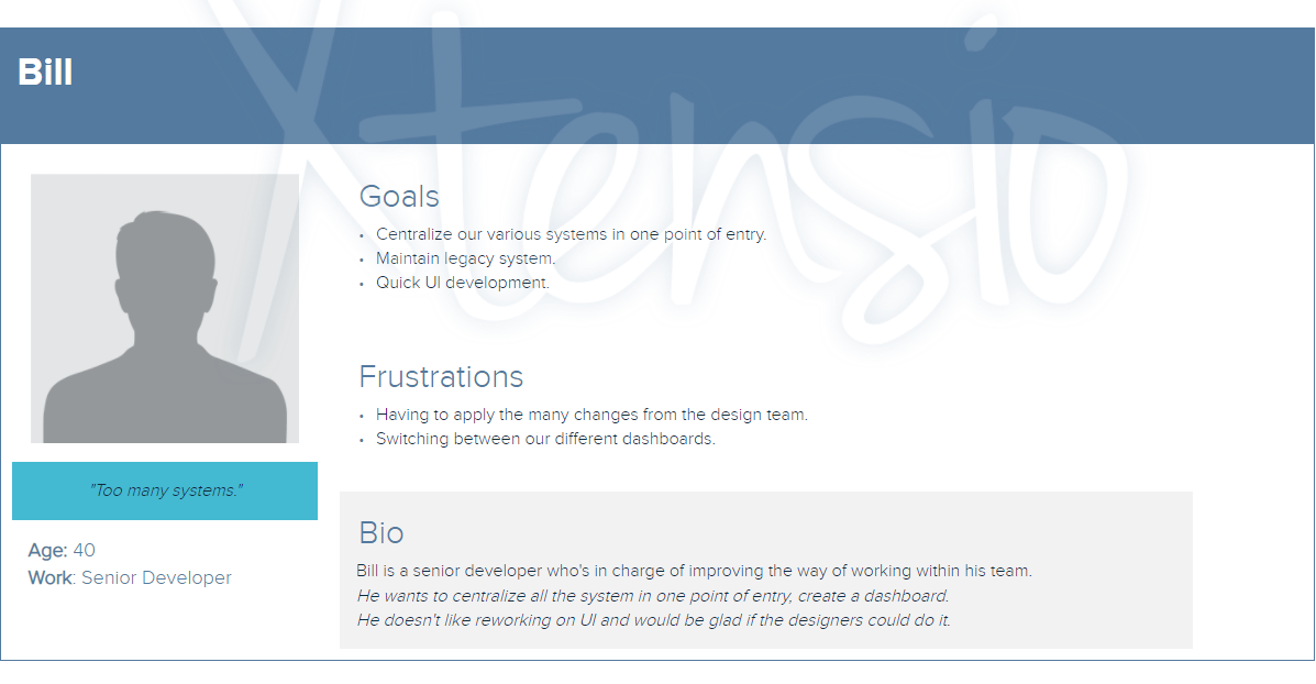
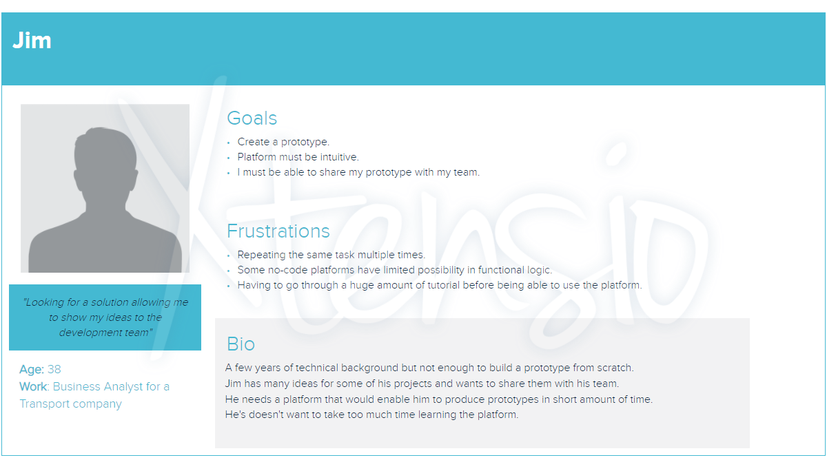
In order to start the evaluation, I created two Personas
- Dev: wants to create a dashboard incorporating all the other systems.
- Business people: whose idea of the product is that it will allow him to create a prototype of his idea.
I then splitted up the platform in section:
- Entry points
- User support
- Navigation
- Editor interfaces
As a guideline, I use the 10 heuristics from the NielsenNorman group and web application best practices.
I made screenshots and small video captures of potential painpoints. Then reported them in a document to share with the team.
Evaluation Results
A few keys results:
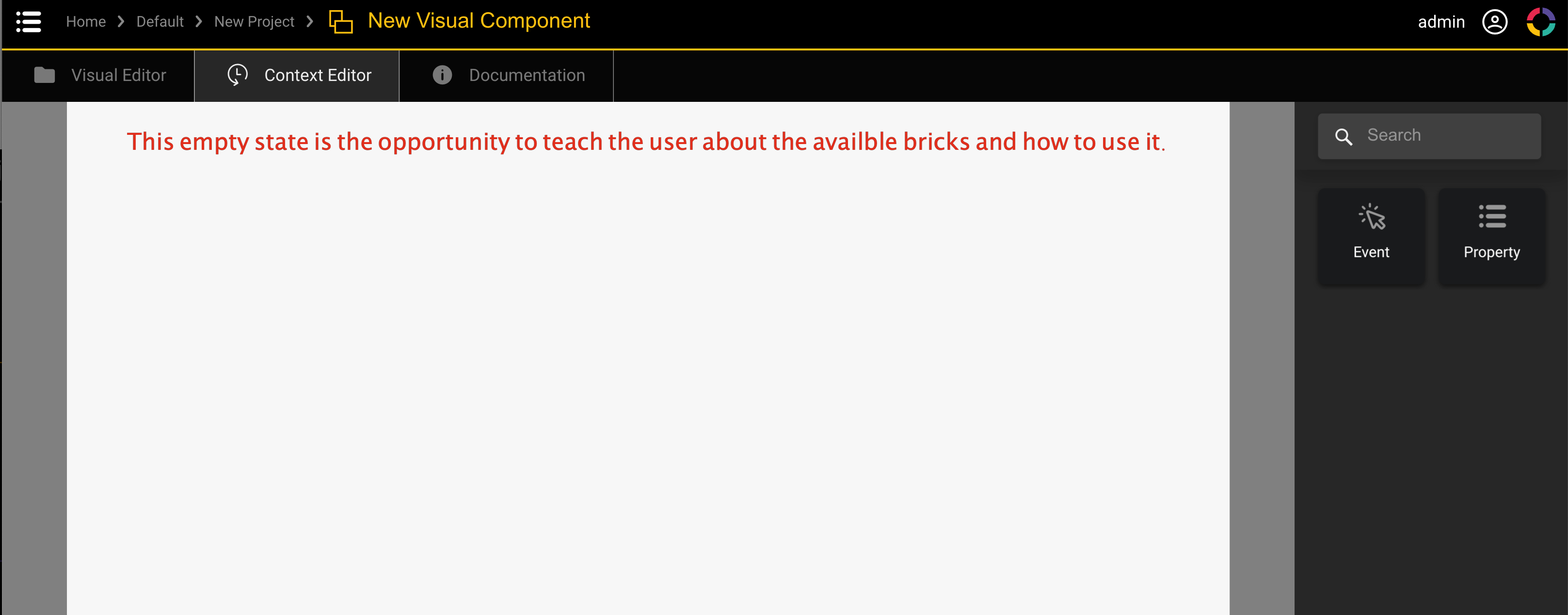
- The empty state of some screens could be improved on. Adding informations would trigger the user to take actions. This could also serve as a passive onboarding.
- The navigation between screens can become tedious. When going through a function structure, it is sometimes not possible to takea back step without having to go to the root element.
- Throughout the application, there is a design inconsistency due to some features being developpe without the input of the ux team.
- During the evaluation, I also found that there is a lack on keybaord controls. e.g. closing a popup when pressing the escape key. Navigating using the keyboard is almost impossible.
In Conclusion, we saw that some improvement are needed in order to offer the best product. We splitted the findings in tasks and created a backlog where we can pick tasks during the next sprints.
II. Recording Remote User Session
Overview
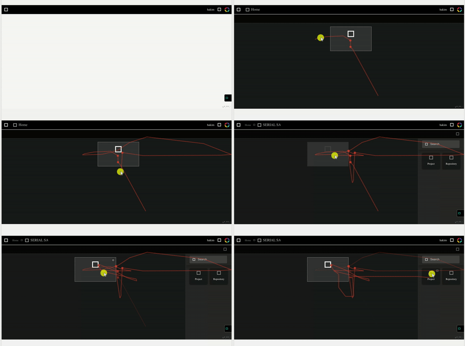
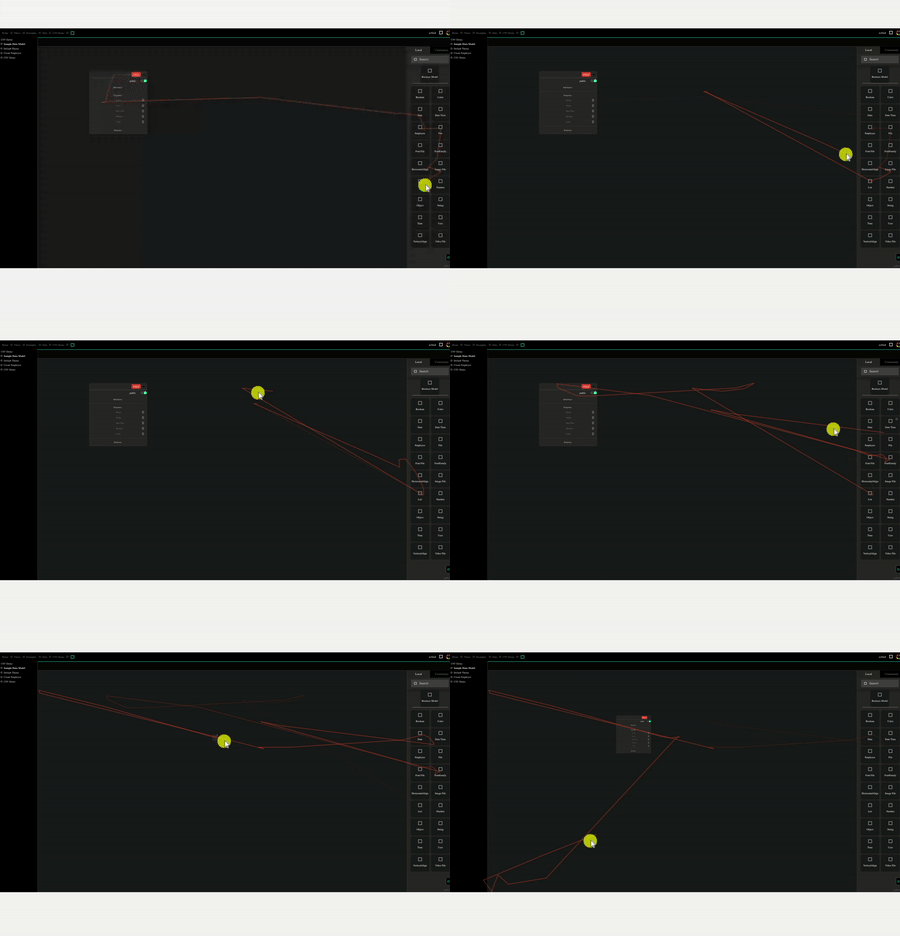
Due to the lack of time to conduct proper user interview, I suggested to use hotjar to record the users while they were using the trial version of the platform. These would be used to validate/unvalidate my findings from the evaluation but also find new painpoints.
Preparation
For each new potential customer, a trial instance is created with a specific url. I created a shared account on hotjar and registered those urls in order to record the sessions. Each user were asked if they agreed to let us analyse their session.
User session results
The results were quite compely, it showed that what we thought to be intuitive was in fact the opposite, e.g. to open a project in the interface you to double click on the project.
Running the prototype was also a pain point, as there was a confusion between icons used.
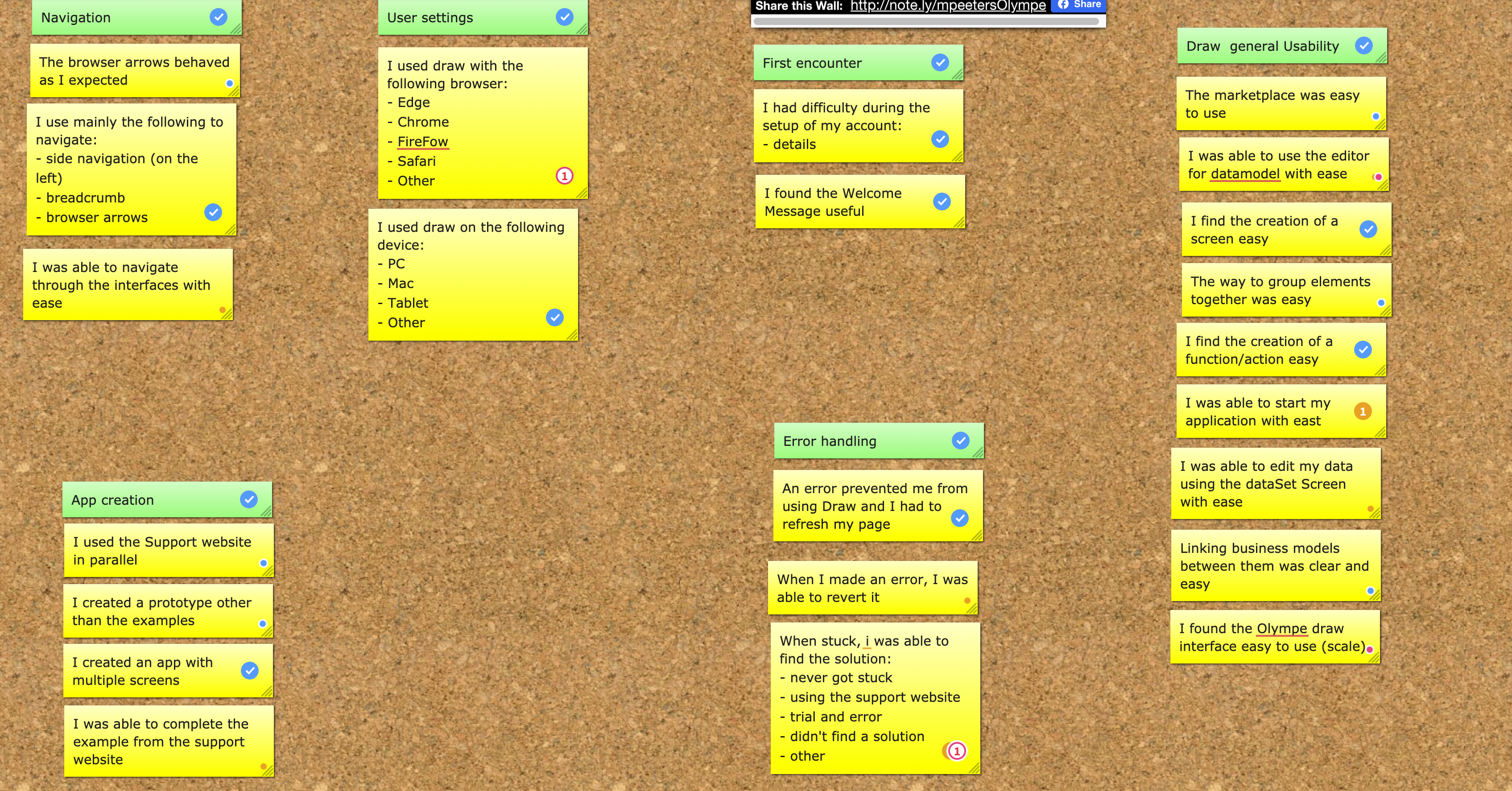
During the analysis, we clipped each section that proved to be a known or new painpoint and added them to the report. We then sent a survey with targeted question but received few responses.
Learnings
It was the first time I ran a heuristic evaluation by myself and I really enjoyed it. I was pleased to see that my feedbacks were validated later on by the recorded user session.
I used hotjar before and again it did the job pretty well. This allowed me to show how users would interact with it, which was a first. Although the record were useful, I think a proper user interview is still required, as we need the verbal input from the user to truly capture his state of mind during the session.
